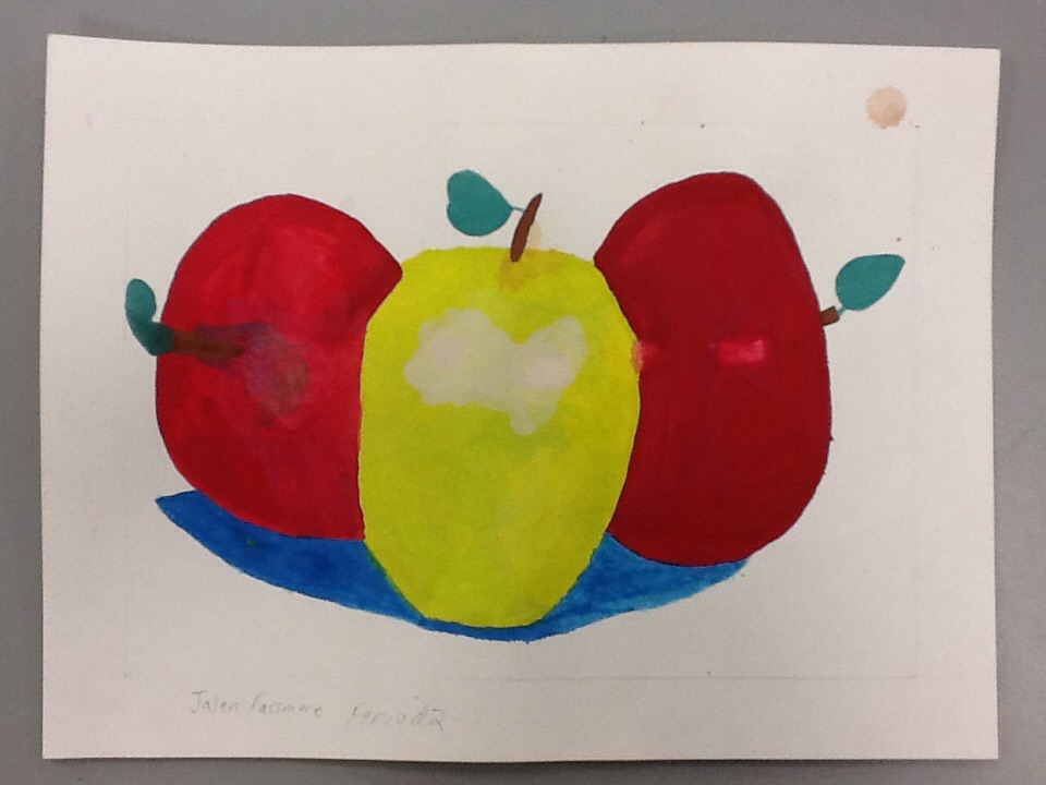
This is my first painting where I used all the same techniques with color where I followed the painting steps to make my apple design look as realistic as I could. I used the light colors before the darker colors to create balance and that resulted in the colors in the end to have unity and harmony with each other. I liked how the finished product looks and the shading of the 3 different apples, like the lighter and darker shades of red and the lighter colored green.
 RSS Feed